
Wednesday, 4 July 2012

Sunday, 1 July 2012


Billie Jean 'Vandal' Analysis

This is Nike celebratory advertisement in honour of the anniversary for 30 years of Nike basketball shoes and launch of the new basketball shoe to celebrate this achievement. The theme of this advert piece is doodling, 80s culture and obviously basketball.
The most notable signs of doodling themes are the maths grid paper which is the paper used for the drawings which woud be found in a school classroom and students would doodle on them using the typical biro pen which what the drawings appear to be drawn using, which is typical doodle pen and normally used in classroom. The overlapping of different doodles makes this a very effective realistic effect because it seems like how a student would just draw what came to their head and there would be no real order or organisation to the drawings.
The old school feel of this advertisement comes mostly from the doodles of iconic 80s characters and themes such as the space invader creature which makes an appearance along with a Rubix cube looking doodle and also the 'peace sign' which was coined and most famous in the 80s.
The obvious basketball themes are laid out all over the piece the most, there are basketball doodle players along with a player which looks like Michael Jordan who is probably the most famous basketballer of all time and has his own line of Nike basketball shoes, there are also several basketball stencils and sketches darted all over the page.
Wednesday, 9 May 2012
AS Graphics Exam Evaluation
My final outcomes have now been finished and I feel that it went well and I feel I was able to capture all the of the effects and techniques that I learned and had planned to put into them. I used the my research and development t the best of my ability and this should definitely have come across in the outcomes, my research of Chris Ede's style and techniques have definite had an impact on the way I went about making my outcomes even taking a lot of inspiration from two that I had analysed. I developed my previous idea that I discussed about using spray paint on the parts I did hand drawn previously in my attempts to make Chris Ede inspired pieces. Also my research into Danny Allison also paid off as analysed where i used chalk textures, I incorporated them into the tracing paper idea to create a speed effect which was inspired from my initial research and discovery of Danny Allison. From my experimentation with the spray paints I had a much better understanding of how they behaved and even to the next level combing matt with gloss and enamel spray paints to add more depth to my final pieces. using enamel spray paint did effect my tie though because of the extreme drying times and high possibility of it dripping and in turn destroying the whole piece but I used theses drying times to prepare other work using the time productively. My understanding of spray paint blending is definitely evident in my outcomes; i have blended two to four colours at a time to great effect. Overall i would say that this was a great success and compilation of ideas, research and developments leading up to a convergence of skills i have acquired along the way.
Experimentation in Photoshop

This is one of my experiments using photoshop inspired by Chris Ede who I analysed in a previous post, this experiment took a long time because I made a lot of changes from te way it looked original because of the extra research into spray paint that I did which led me to use spray paint as a texture for my background instead of the less interesting generic background. I feel this is an interesting twist on the amazing work of Chris Ede and adds another element of creativity to what was already very creative technique. I used Manchester's Metrolink tram as the centre piece because this is a key part of the transport of in my chosen city. Overall I enjoyed this experimentation because of the freedom it gave me to expand from the centre of the piece and make composition based on the image chosen to be the main focus of the piece and that is why I took my inspiration from the artist in the first place.
Experimentation in Photoshop

This is one of my experiments using photoshop inspired by Miles Donovan, this was an interesting experiment because I found it hard to find an image that I thought would look interesting and different when I applied the technique to it. I chose the an upshot of buildings because I felt that the shape of the buildings in conjunction and the windows would bring out this technique in the best way possible. I found that adding colour really distinguished the shapes in the piece in comparison to the simple black and white image so I made two different colour versions. Overall I felt this Miles Donovan technique experimentation was very successful and I enjoyed making this technique work with building in comparison to the pieces using people and figures that I have seen.
Tuesday, 8 May 2012
Black, White and Colour Effects Technique

This is my personal experimentation with this technique and will be part of my final outcome because i feel that the way it accentuates colour is a definite road that i would like to take my illustrations. I made it by making two layers, one of the picture and the other filled with grey; the blending mode for the layer is set to colour to give the black and white effect to the picture, the final step is to use the rubber tool to erase the parts of the image that you want to be color and you have an impressive black, white and colour image of high quality standard.
Danny Allison Analysis


Chris Ede Analysis


Lino Analysis
Characteristics:
Smooth
Durable
Bendy
Tough
Flat
Hard
Thin
Reinforced
You can cut/Carve it
Potentials:
Carve it
Print it
Emboss
Rubbings
Reduction printing
Sturdy
Can print onto different surfaces
Easy for simple or big designs
Limitations:
Mistakes are irreversible
It not a 3D surfaces
Most work hard to get texture
Hard to cut
Limited colour application
Rollers etc
Hard to clean,
Hard to get off hands
Barrier cream for hands
White spirit fumes are dangerous
Long time to dry
Not easy to pick up skill
Difficult to carve detail
First I traced a drawing that I had drawn previously and put it over my lino and held it in place using sellotape and went over the tracing on the lino to get at least a faint imprint of the tracing on the lino as a guideline. Then I used the lino handle to carve out over the guidelines and paying attention to the intricate details that are there
Monday, 7 May 2012
Development Photos


These are my development photographs that I took in London and Manchester to help broaden my understanding of buildings and landscapes in these parts of the UK and help me in my further developments and understandings of these places which I will use in my final outcome.
Spray Paint Experimentation


These are my spray paint first experiments that I have made, the first one was inspired by another spray paint artist that I had seen and attempted to replicate. The second piece is me experimenting with mixing colours and using objects to create a composition. The bottom example is a large experiment where I layered pieces of paper overlapping in different ways and sprayed them abstractedly to make an effect when the paper is moved which made interesting blending and shapes on the paper.
Sunday, 6 May 2012
Exam Proposal
For my final outcome in exam I will be making 5 different posters around my chosen city which is Manchester. I chose Manchester because I feel it has a lot to offer in terms of interesting buildings to draw and manipulate in Photoshop such as renowned Manchester United Old Trafford stadium, Manchester Central Library and the Royal Northern College of Music just to name a few. Not to mention the city center in general which is full of interesting shapes and buildings which make a great composition when drawing or photographing. I think overall this was the right choice for the direction I would like to take my final outcome. I will be using spray paint to do most of my posters and also drawing and sketches that will be incorporated in my outcomes which will then be further edited and cleaned up.
Travel Related Tickets

Paper Installation Group Activity


This is a paper installation made by my group completely inspired by Darcy Pendergrast's Sydney Opera House Art Installation which analysed previously. In similar style we tried to construct a civilisation including a large hotel like building complete with residents in coloured windows, we tried to have some fun with the project and add some humour to our installation as you can see from the sun complete with sunglasses and facial hair. this was a very fun and creative project and would love to try this type of art again but maybe with more materials to use because the limit of materials and time really did effect the overall presentation of the installation and i feel more materials and time would allow our group to make a much more detailed and vast civilisation closer to Darcy Pendergrast's level
Saturday, 5 May 2012
Research of Possible cities for My Illustration


.jpg)
Images: 1: Kingston, 2: Manchester, 3: Tokyo, 4: New York, 5: Rio De Janeiro , 6: Barcelona
Friday, 30 March 2012
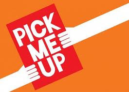
Pick Me Up Exbitition

The Pick Me Up Exhibition was an contemporary graphic art fair experience run at Somerset House from 22 March - 1 April 2012. I found this event very insightful, discovering such a large variety of graphic art that I had never come across before and I found it exciting to see in real life some of the artists that I had heard of and researched previously. Some of the artist which were related to the illustration brief that I chose were Chris Dent, David Sparshatt and Zelbot. The artist gave us an insight into how to create pieces similar to there own which will help in my final outcomes and there will definitely be hints of there work in mine where i have tried to incorporate all the i have learned from this art fair as possible.
Monday, 26 March 2012
Postage Stamp Analysis

Thursday, 22 March 2012
In depth analysis of paper made creation by Peter Callesen


I think that the piece is symbolic to feeling of breaking free of limitations going for what you want in life as the hummingbird is breaking free from the limits of 2D and basic shape and features to get to the flower which is what it would want, so i think that interpretation is easy to get from the piece and the desired effect.
I think the choice not to use colour adds to power of the piece because it keeps the emphasis on the objects themselves whereas if it had a lot of colour it may take away from the message it is truing to present and the viewer would lose the focus on freedom and just concentrate on the painting and any detail presented through the paint. The white works really well with the concept of the piece because it keeps your attention to what the piece is trying to portray and allows you to recognise the detail of the 3D sculptures more clearly on the wings and tail parts of the sculpture. The usage of space is key to capturing the concept of getting what you want because it reflects pursuing what you what and going to get it because of the space between the bird and the flower.
This is the type of artistry that is normally associated with Peter Callesen whom lately has mainly been doing paper sculpting and other forms of art mainly using the medium of paper to make pieces of art and then photographing them in a way which accentuated the visuals of the piece and made the main focus easily noticeable as the focus of the piece.
Thursday, 15 March 2012


Subscribe to:
Posts (Atom)