
Thursday, 28 February 2013

Wednesday, 27 February 2013
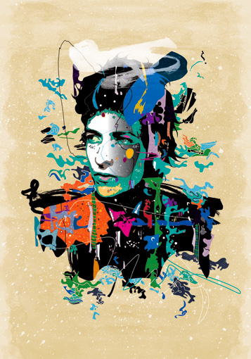
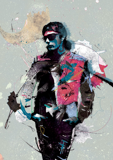
In Depth Analysis of Raphael Vicenzi


These pieces of art work were designed and created by the artist Raphael Vicenzi. He is a 35 male from Brussels, Belgium. He has been recognised by established art publication mediums such as Illustration now 3, The Beautiful, Advanced Photoshop, Digital Arts and many other books, publications and on the web. I have chosen to analyse these pieces because this style of illustration is one I would like to take on board for my own work in the near future. This is a style that I would like to master and use this watercolour style of illustration within my illustrations. I have loked around for interviews or blogs of Raphael Vicenzi and I found it very difficult to find many detailed texts from the artist. I eventually found an interview where Raphael Vicenzi opens up and explains his artistic background. In this interview he explains where he draws some of inspiration from and why he has made certain artistic choices in his work. Source.
The theme of Raphael Vicenzi's work seems to be a theme of experience and his personal view translated through illustration. The work is very powerfully illustrated partly through the art style itself but also the colour used and the way the are mixed and merged. It is also emotive of the message it is supposed to be proposing. The Raphael Vicenzi has tried to instill a deeper meaning to his works especially through his use of typography in his illustrations normally being thought provoking words such as "Riot" or "Truth".
The techniques used are watercolours with markers and pencil to get the initial effect and the images are edited and sharpened up on Adobe Photoshop on a PC. The colour is one of the most important parts of the images that Raphael Vicenzi produces because its the softness of the watercolour coupled with the actual colours that he chooses that create a mood in the creation. Also the shapes that these watercolour colours are presented in also contributes towards the stunning effect produced.
Monday, 25 February 2013
In Depth Analysis of Julia Pott work


Both of theses pieces of work were designed and created by Julia Pott who is a animator, illustrator and Royal College of Art graduate with an MA in animation and resides in Brooklyn New York. She has received high commendations as she was named by Flimmaker Magazine on the 25 New Faces of Independent Film. The name of the two pieces of work are, at the top 'Here With Me' and at the bottom is called 'Kissed'. These two pieces were handmade and illustrated by Julia herself drawn with pencil and the colour was applied through a computer. the two creations were made two years apart, 'Kissed' being made in 2012 and 'Here With Me' made in 2010. These two creations were both made for personal illustration and not for one of the few independent films that Julia Pott has also been successful with. I have chosen to analyse these particular pieces as I am about to undertake an illustration exam brief and I would like to approach the piece similarly to theses pieces.
I have found sources that have given me a deeper understanding of Julia Potts work this was through an interview that she did with inkygoodness. In this interview she gives te audience an opportunity to understand her artistic choices and how she names and approaches drawing her characters. Source. I think that the theme of most of Julia Potts's work is the illustration of more awkward moments of everyday life that are not normally talked about openly but she choses to bring them to the forefront without actually speaking about it, I think she picks up on the feelings of people that are not normally expressed openly. The style and techniques used for Julia Potts pieces is line drawing and colour illustration, and expert level of depth is used in Julia Potts pieces as depicted in each of these images. The use of colour in these images is cleverly applied as it makes sure not to distract from the focal part of the image and also allows the characters to always be the centre of attention. The two pictures represent there characters differently as in 'Kissed' it is quite a tight shot with the background scenery still involved but as an afterthought to the characters where as in 'Here With Me' its a much wider shot and the background colours and shapes are almost as important as the characters creating a setting for the charcters. In 'Here With Me' there is quite a large focus on pattern on different parts and this adds a different dimension to that piece on the other hand in 'Kissed' the focus is more on texture especially on the ground which is a intricately detailed illustration of dry land with small patches of grass also the fur of the characters is very detailed which is comprehensive of Julia Potts style.
Thursday, 14 February 2013


Wednesday, 13 February 2013

Wednesday, 6 February 2013


Evaluation of Personal Project
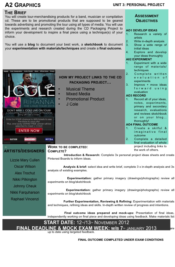
For this project we were able to choose what we were going to do but it must tie into the CD packaging project. We then created are very own brief for how we wanted to go about the project in any medium we wanted.
I started off by creating 3 unique initial ideas as a starting point before developing them as mood boards and putting elements of them all into a mindmap. After all the planning I decided to act upon making a authentic tour poster and t shirt for the tour as promotional products for the tour. I then proceeded to analyse Nikki Pilkington and Johnny Cheuk as these were artists that enjoyed mixing materials and different types of media to produce different outcomes. I also analysed two posters that J Cole, my artist had used previously and through analysis of the posters I used them as inspiration for my own work. I then started the experimentation phase, experimenting with different tutorials found on Youtube and handmade work inspired directly by Nikki Pilkington, I found this stage the best in terms of development of ideas and general progression especially in terms of thinking towards my final.
I finally started my final outcome and I felt extremely confident about starting as I knew exactly how I was going to do it and was eager to turn my thoughts into reality. I started by creating a base photo I could use for my idea but this would mean merging three completely different images together to create a whole new independent photograph which i had learnt earlier this year. This was already difficult as because of the resolution from the poor camera combined with the mirror having noticeable streaks on it meant as well as working through several layers of masking I also had to use the mixer brush tool on specific setting to disguise the streaks not to spoil the entire piece.
After creating the photo I added the effects starting on the evil side, I added the flames masking and texturing them so they looked as authentic and genuine as possible on the body, I turned up the levels and hue saturation layers and masked it to the left side and the light would be most noticeable on that sideI also added and extra glow layer and masked it over the body to add an effect of heat coming off from the flames.
I then advanced on to the good side of the image, I used an energy ball photoshop tutorial I had found in independent study and experimented with it to create the aura effect I was looking for, I also applied it in different ways with different strength layering them to show the power radiating from the model. After initially completing the aura through assistance from the tutorial I decided that it was still not exactly the effect I desired and changed some of the layer setting to make the lighting more radiant and shimmering adding the star tool effect I had created to the aura as well.
I created the title using the same effects that I had used for there associating parts of the image, and fonts that correspond with the affect that it is supposed to represent before masking them in to the original image. The image was then put into traditional poster format using the analysis of J Coles previously used posters that had inspired me.
I am very pleased with how my outcomes have come out altogether as a whole because I feel that they have come out exactly how I envisioned which is always the goal when you start out. I also feel that the poster is very realistic and something that could potentially be used for real in the real world.
I started off by creating 3 unique initial ideas as a starting point before developing them as mood boards and putting elements of them all into a mindmap. After all the planning I decided to act upon making a authentic tour poster and t shirt for the tour as promotional products for the tour. I then proceeded to analyse Nikki Pilkington and Johnny Cheuk as these were artists that enjoyed mixing materials and different types of media to produce different outcomes. I also analysed two posters that J Cole, my artist had used previously and through analysis of the posters I used them as inspiration for my own work. I then started the experimentation phase, experimenting with different tutorials found on Youtube and handmade work inspired directly by Nikki Pilkington, I found this stage the best in terms of development of ideas and general progression especially in terms of thinking towards my final.
I finally started my final outcome and I felt extremely confident about starting as I knew exactly how I was going to do it and was eager to turn my thoughts into reality. I started by creating a base photo I could use for my idea but this would mean merging three completely different images together to create a whole new independent photograph which i had learnt earlier this year. This was already difficult as because of the resolution from the poor camera combined with the mirror having noticeable streaks on it meant as well as working through several layers of masking I also had to use the mixer brush tool on specific setting to disguise the streaks not to spoil the entire piece.
After creating the photo I added the effects starting on the evil side, I added the flames masking and texturing them so they looked as authentic and genuine as possible on the body, I turned up the levels and hue saturation layers and masked it to the left side and the light would be most noticeable on that sideI also added and extra glow layer and masked it over the body to add an effect of heat coming off from the flames.
I then advanced on to the good side of the image, I used an energy ball photoshop tutorial I had found in independent study and experimented with it to create the aura effect I was looking for, I also applied it in different ways with different strength layering them to show the power radiating from the model. After initially completing the aura through assistance from the tutorial I decided that it was still not exactly the effect I desired and changed some of the layer setting to make the lighting more radiant and shimmering adding the star tool effect I had created to the aura as well.
I created the title using the same effects that I had used for there associating parts of the image, and fonts that correspond with the affect that it is supposed to represent before masking them in to the original image. The image was then put into traditional poster format using the analysis of J Coles previously used posters that had inspired me.
I am very pleased with how my outcomes have come out altogether as a whole because I feel that they have come out exactly how I envisioned which is always the goal when you start out. I also feel that the poster is very realistic and something that could potentially be used for real in the real world.
Sunday, 27 January 2013

Wednesday, 23 January 2013
3D Poster Experimentation

Analysis of Typography based J Cole Poster

The artwork makes me feel very calm and collected with a smooth edge is necessary when making a poster that it has some flair and an edge which can keep a passer by interested in the poster long enough to want to know what it is about. This is a typography poster for J Cole which is promoting the album coming out. The music is hip hop and a calm and smooth style and this is reflected in the type through the shapes, styles and colours used. The audience being targeted are not only people that are fans of the artist but general hip hop fans because J Cole is one of the most higher followed hip hop artist of this generation which means all hip hop fans will listen to his album. The poster has to reflect that fact so it will try to cater to all.
The typography is very reflective of the genre it is representing, and has been designed to be easily representative of the hip hop culture especially as J Cole is a highly respected hip hop artist the feel of his posters should feel very authentic.
The styles used are very aesthetically pleasing, using a spirograph technique which is in a clipping mask for bold typography. The spirograph creates a calm mood through the curves and smooth edges used. The techniques used are clipping mask and spirograph which have been merged together and work well together. The spirograph is designed and created and then placed underneath the shape that is going to use the image in this case it is J Cole typography extreme bolded to allow for a better view of the spirograph underneath. Underneath the spirograph clipping mask there is additional typography in a west coast style which is another hip hop style which is relational to the genre that J Cole delves into.
The J Cole typography is easily the largest and most poignant part of entire piece and this makes sense as it is the name of the artist the poster is promoting and is therefore the important thing on the poster. It is laid out in this way purposely to make the artist name the focal point for obvious reasons. This poster also includes the record label clearly at the bottom which is in a stand out colour and is used to represent the artists affiliation to the group as a whole. Altogether I do really like this poster, i like it because as well as covering the main concepts of a merchandising poster, it adds something new through the spirograph element which is original and interesting aesthetically. This will influence my ideas in terms of typography very much as I will know try and incorporate an abstract and different element to my typography and remember the importance when designing.
Analysis of J Cole Tour Poster

This is a very conservative piece compared to tour posters by other rap artists especially artists of the same genre which are usually very loud and have a lot of layering of images to add depth to the image.
This makes the viewer feel very mellow and calm as most of J Coles music does, so in that way it suites him and his audience perfectly. J Cole is a rapper from North Carolina he has very lyrical and laid back, skippy flow which is attractive to the ear and has gained him a very large following. The target audience for this tour and in turn this piece is core hip hop fans that enjoy hip hop music. The imageries' biggest relation to the music is the colours used, yellow ochre which is the only actual colour used and is very mellifluous the black and white image of the artist which represents him in a calm way along with the very quiescent emotion on his face which relates to the motion and flow of his music.
The artist has been photographed in an almost film noir style, using the shadows to cover half the face of the artist but highlighting the front profile. This photographic style gives an almost angelic look to the artist which suites him. The position and pose of the artist is quite a powerful one and could be interpreted as inspirational which I think was deliberate as there is no other objects or imagery to distract away from the artist as the main attraction for the piece. This made sure that the powerful pose is enough to make the poster still stand out and other things do not consume the artist on the page; this also leads back to the colour usage which is very basic and bland to allow the image of the artist to stand out.
This poster was most likely created in Photoshop using a photograph taken in a film noir style and the levels of the image have been adjusted to make the light aspects lighter and the darker section darker creating this impressive and immersive image. The typography aspects are all fairly basic and conventional except the artist name which is quite large and is the only type which is in colour, which makes sense that it is the artist name which is in colour and largest as it is the most important part as it most important that viewers know who the tour is for. The poster is laid out in a basic way but in an intelligent way, keeping the artist name, location, time and date at the top of the image as the first point of contact for the passing viewer. Lower down, but larger than location, time and date is the presenters and the price which are are also very important to the success of the poster.
I do really like the poster and choose it out of a selection specifically as i like the direction in photography and design that it took. This will probably effect the way I approach my own poster and I will definitely take inspiration from it for my own pieces especially the photographic style and I will take into account the style and sizes of the typography elements.
Wednesday, 9 January 2013
Flame Editing Experiments

This piece of experimentation was to test and element of editing that I will bring into the the final piece and I used a tutorial that I found from my personal study to create because I already knew what I wanted to create but not how to develop some of the elements needed to make it as best as possible. I had looked through many different tutorials on flame techniques and decided besides the amount of time it took to get this quality that it was worth it to get the best quality outcome.
http://www.youtube.com/watch?v=QgTJ-lfKmMU

Watercolour Editing Experiments


This experimental piece is a piece which I thought I could use in my earlier ideas for my outcome and I used and tutorial for the basis of the experiment but once I got the hang of it I tried out other ways of producing a similar effect. This was made using different texturing layers and and a photo using the dark parts of the image as a canvas to edit on top of.
http://www.youtube.com/watch?v=VSMSTcq2a8A
Monday, 31 December 2012


Wednesday, 5 December 2012
In Depth Analysis of Niki Pilkington
Niki Pilkington is a illustrator from the Uk
that specialises in mixed media images usually using
incredible pencil drawings as a base and using more unconventional objects and
materials on top of the pencil drawn image to make what seemed like just a person
posing into a colourful vibrant composition
Niki Pilkington graduated from Ravensbourne Academy of Design & Communication with a First Class Honours Degree in 2009. She's been promoting interest in the fashion industry working with companies such as of Elle, Ugg and Topshop and no doubt there will be more offers from other companies in the near future
Niki uses pencils, pens, fluorescent markers & collage to make amazing compositions that are unique to her style and easily identifiable as her style. The mix of all these elements creates images with such life and humour, combining humour with seriousness and creating fun images that hard not to like. The 3D element to her work is a quirky way of adding depth to the piece because it almost makes you want to reach out and touch. She uses materials and objects that make her illustrations as effective as pop out images because the quite literally lift up off the page. Perhaps this is why Niki's work is so sought after by fashion houses & stores; that ability to bring design to life is an amazing skill that Niki exudes


In Depth Analysis of Johnny Cheuk
Johnny Cheuk is a graphic designer and illustrator based in
Hong Kong, China. With a background in digital media, Johnny experiments with a mix of
traditional and cutting edge media materials to create his art that is easily recognised as his work. Blending
computer graphics with watercolour and pen and ink to explore avenues of creativity that others wouldn't dare challenge and express his own unique style that hes so well known for.
Johnny's work is now being widely recognised as the place Johnny’s work has been published in numerous magazines, books, websites and exhibitions. His previous commissions include music album cover art direction and illustrations for Hong Kong pop singers G.E.M., covers for Computer Arts Magazine (UK), and illustrations for Adobe and Readers’ Digest and Movmnt magazine. His illustration was selected for 1,000 Works from 100 Young Designers by ooogo a respectable chinese branding website well recognised by the chinese public and 30 Fashion Illustrators You Can't Miss by fashionary.org. He was picked as one of the 200 Best Illustrators Worldwide 2009/10 by Lurzer International a worldwide respected advertising archive website.
Johnny's work is now being widely recognised as the place Johnny’s work has been published in numerous magazines, books, websites and exhibitions. His previous commissions include music album cover art direction and illustrations for Hong Kong pop singers G.E.M., covers for Computer Arts Magazine (UK), and illustrations for Adobe and Readers’ Digest and Movmnt magazine. His illustration was selected for 1,000 Works from 100 Young Designers by ooogo a respectable chinese branding website well recognised by the chinese public and 30 Fashion Illustrators You Can't Miss by fashionary.org. He was picked as one of the 200 Best Illustrators Worldwide 2009/10 by Lurzer International a worldwide respected advertising archive website.

Thursday, 29 November 2012

Friday, 23 November 2012


Thursday, 22 November 2012



Experimental Packaging


Subscribe to:
Posts (Atom)