
Thursday, 29 November 2012
Friday, 23 November 2012


Thursday, 22 November 2012

Experimental Packaging


Thursday, 15 November 2012
Prototype Experimentation
This is my prototype much which served as a tester product to determine what changes in materials, print quality, and image editing were necessary. Examples of changes made are that on the prototype I printed my designs onto two pieces of standard paper and stuck them on to card which made it hard to bend intricately and also allowed a lot of problems with air bubbles under the paper on both sides. There were also issues with the quality of print when printed onto the paper and even when tested on the glossy paper the full detail of all components on the images was not very well represented which led to my decision to pay for professional printing straight on to A1 photo paper for the best print and image quality possible. Also, the margins that I set for folding between images on the surface design were far too small which was evident even from the scaled down version so I made the changes to the design so that there was adequate space to fold.
CD Design Experimentations


Tuesday, 13 November 2012
Poster Experimentations


These are poster ideas and experimentations that I played with to create the poster I would like to include in my inlay for my final packaging. The first example is a large landscape fold out poster for walls I combined my first cover image with my logo and the Dreamville records tag keeping it relevant to the theme. The second example is another large landscape foldout designed for wall space, I designed this by cutting all my cover images into slides or slabs in a way which puts them into stages.
The final example of my poster experimentation is a horizontal image designed for a door and this was an idea that like the first example could be used for anyone of the cover images individually.
Sunday, 11 November 2012
CD Packaging Project Evaluation
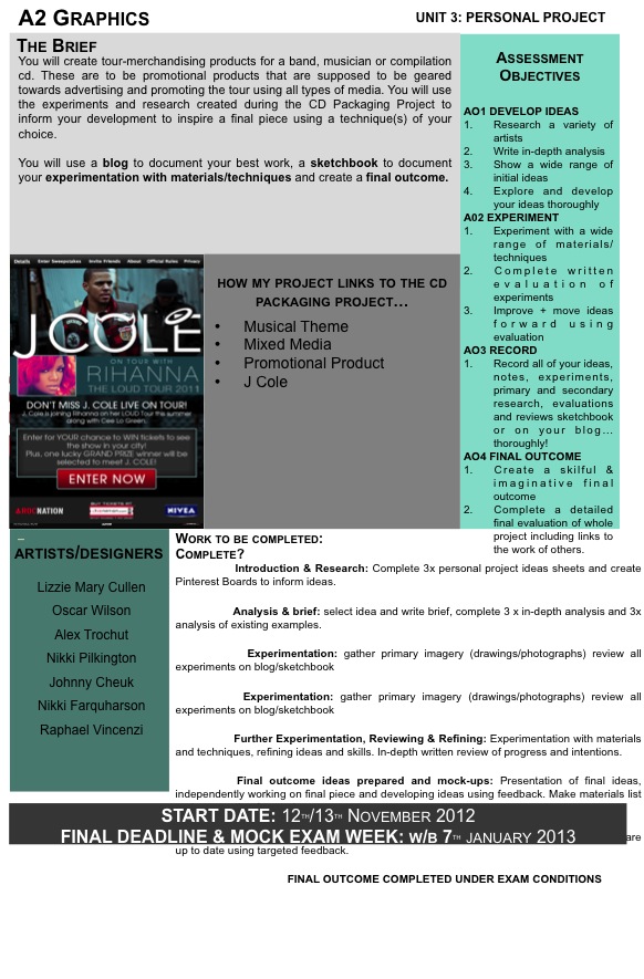
For this project we had to design and create our very own CD packaging for an artist of our choice making sure that the design was suited and relevant to the artist but also practical for purpose. This project has definitely been the most challenging for me in terms of workload and organisation especially as I had to outsource some of materials and resources. For my outcome I chose the artist J Cole a american Hip Hop artist, I chose him because I identify with music and I thought this would make it easier to come with ideas on the theme of the CD packaging. My idea for how I was going to design my packaging did come easily and I had several very different ideas to choose from some entailed paper cutting, modelling and paper construction. In the end I opted for a more simple approach so that I could focus more on the visual design and surface design.
My inspirations mostly were J Coles passed projects artwork which were closely related to basketball and the style was inspired by the way I feel street ball is depicted from images that I researched independently and that was the main basis for my design direction and the way I took my pictures. Martin Stasiuk, a fellow londoner is one graphic designer I stumbled across which heavily influenced and inspired the overall composition of my surface design. His piece called 'Basketball Dream' is a concept I tried to capture in my outcome, the combination of photography, imagination and photoshop is definitely something I aimed to convey in my own outcome and I think I managed to achieve it. I used some of my own photos; the background sky image and my basketball model as did Stasiuk and then imagination to make a living scene out of these elements.
 I experimented with different background textures trying to keep them as mellow as possible because J Coles music is quite calm and I wanted to find a background which was fit for purpose. In the end I decided that I didn't need to have a traditional patterned background and wanted to capture the street feel of J Coles mix tapes so I used photos I took myself of the sky and combined them with my photo shoot pictures to make it look as if the model was playing street ball.
I am very happy with the way my outcome has turned out because I think it looks extremely professional which was not easy to accomplish at all and it took a lot of trial and error to achieve because of problems with printing settings in college and outside of college. using several different types of paper and card and different sizes to achieve the best result even using my own money to pay for professional printing. I think the thing that I feel was the biggest achievement is the actual application of effects on my images, the huge transformation from standard photos to a a new powerful image. Each picture took me approximately 2 hours all together to edit by the time it was ready I to print this was very time consuming as there were 5 images some of them presenting challenges that I had to be innovative to deal with.
There were a few things that I feel could have gone better mostly I am disappointed I did not get the opportunity to put all the effects I wanted to use on the photos because of time constraints. I had originally planned to add an dispersion or disintegration effect on to the model in my images and had prepared and practiced the technique ready to use it. I also did want to improve the finish of my product by paying for it to be professionally laminated for it to be more of a smooth finish.
To conclude, the project was something I enjoyed because it was a change, and creatively something that people can relate to because everyone can relate to music but also is an easy medium to be creative with. I really do enjoy making packaging because of the sense of freedom to do what you want with it. The personal project is something I think I could find interesting and something I am looking forward to because there are several stand out things about me I could put into it making this project all that much easier to tackle.
My inspirations mostly were J Coles passed projects artwork which were closely related to basketball and the style was inspired by the way I feel street ball is depicted from images that I researched independently and that was the main basis for my design direction and the way I took my pictures. Martin Stasiuk, a fellow londoner is one graphic designer I stumbled across which heavily influenced and inspired the overall composition of my surface design. His piece called 'Basketball Dream' is a concept I tried to capture in my outcome, the combination of photography, imagination and photoshop is definitely something I aimed to convey in my own outcome and I think I managed to achieve it. I used some of my own photos; the background sky image and my basketball model as did Stasiuk and then imagination to make a living scene out of these elements.

I am very happy with the way my outcome has turned out because I think it looks extremely professional which was not easy to accomplish at all and it took a lot of trial and error to achieve because of problems with printing settings in college and outside of college. using several different types of paper and card and different sizes to achieve the best result even using my own money to pay for professional printing. I think the thing that I feel was the biggest achievement is the actual application of effects on my images, the huge transformation from standard photos to a a new powerful image. Each picture took me approximately 2 hours all together to edit by the time it was ready I to print this was very time consuming as there were 5 images some of them presenting challenges that I had to be innovative to deal with.
There were a few things that I feel could have gone better mostly I am disappointed I did not get the opportunity to put all the effects I wanted to use on the photos because of time constraints. I had originally planned to add an dispersion or disintegration effect on to the model in my images and had prepared and practiced the technique ready to use it. I also did want to improve the finish of my product by paying for it to be professionally laminated for it to be more of a smooth finish.
To conclude, the project was something I enjoyed because it was a change, and creatively something that people can relate to because everyone can relate to music but also is an easy medium to be creative with. I really do enjoy making packaging because of the sense of freedom to do what you want with it. The personal project is something I think I could find interesting and something I am looking forward to because there are several stand out things about me I could put into it making this project all that much easier to tackle.
Tuesday, 6 November 2012
Surface Design Experiments


Final Surface Design Images and Inspiration


These are my images from the photo shoot fully edited in Photoshop and ready to be used for the inside cover of the CD Packaging, I created these images by combining my photo shoot photographs and the photographs of the sky which I used as a background theme for all the images.


These are images that directly linked to my surface designs and what I looked at when trying to get inspiration for the design, I took the huge relation between J Cole; my artist of choice and basketball to create something that would easily be recognised as a connection to J Cole and I hope I achieved that.

Monday, 5 November 2012


Photoshoot Development Ideas Example

A lighting effect that I found in independent research to alter the filtering, exposure and curves. This is just a sample of some of the tutorials and ideas that I am trying out to find the perfect balance and the effects I will use on my final image
Photoshoot and Development


These are the photos produced during my photoshoot with a basketball theme, I used the quick shutter effect to capture as much of the sequence of the lay up performed by my model. They will be used for the inside cover of my final product as a surface design. I will be using a hard light effect on the image using photoshop to create the final image fully rendered .
Subscribe to:
Comments (Atom)